


Definition of parallelism The balance between two or more similar words, phrases or clauses is called parallelism in grammar. Parallelism is also called parallel structure or parallel construction. Parallel construction prevents awkwardness, promotes clarity and improves writing style and readability. Rules of parallelism are also described in the Microsoft writing style guide. If you are interested to learn more concepts read our complete syllabus. Examples: Rules of parallelism If you are exploring technical writing as a full-time career do not miss to read. You can also consider reading the comprehensive guide on content writing.

Resume for technical writers
10 Kickass Resume writing tricks for technical writers A resume for technical writers is considered a work sample, so we must do our best and avoid common mistakes. I hope the following suggestions will help you to create a kick-ass resume. 10 tips on what makes a technical writer CV hot: 1) Stick to a maximum of two pages. Always remember the CV hotspot – the upper middle area of the first page is where the recruiter’s eye will naturally fall, so make sure you include your most important information there.UX concept. 2)You can use two types of CVs – chronological or skill-based. For the former, use the last job as the starter and move to academic qualifications; for the latter, describe the skills earned from different work experiences and education. 3) Always include Your name, address, date of birth (in some countries this is not required due to age discrimination laws), and contact details (telephone number and email). For educational qualifications, state your degree, subject, and name of the school, college, and university, plus grades (if you were a topper). Flaunt what you have. 4) Work experience: This is the most important part of the CV because most employers try to select for the current job opening as close as possible to the previous work experience of the candidate This should have two parts – name of employer, roles performed in the company, and duration. 5) Be sure to highlight what you did – quantifiable achievements. Also, do mention promotions and awards. 6) Part of the Work Experience section should include the skills required for the job. The reason I highlight this separately is so you don’t miss it. 7) Skip “Interests”. Unless this in some way reflects the value you will bring to the job, I would suggest you skip this. However, if you insist, interests like “networking”, being part of diverse clubs (golf, theatre), sky-diving, mountaineering (displays you move out of your comfort zone), and being captain of the hockey team (team skills, leadership) can be added to bring some color into your CV. 8) References: Again, I would suggest you skip this until you have been called for the final interview. During your interviews, you will realize you need a reference who would be able to substantiate a certain aspect of your experience important to this role. You can then provide relevant names for reference. Usually, a previous supervisor, direct reportee or peer is a good reference. 9) Covering letter: this should accompany your CV. The letter must be addressed to the Recruitment Manager/Hiring Manager/HR Head and should explain in a short paragraph your career objectives and the reason for applying to the company for the particular role. 10)Avoid “Cut, Copy, Paste”– While you may be applying to different companies at the same time, it’s very important to avoid “Cut, Copy, Paste”. Each covering letter and CV must be customized for the company and role that you are applying. If you expect to be selected amongst hundreds of other CVs, this investment is critical and worth it. So what makes a good CV? The CV is easy to read, well laid out, and not over-crowded.It’s customized for the job you are applying to You highlight the relevant skills you have for the jobIt is a concise document with no grammar or spelling mistakesIt is not exaggerated and reads honestly What are the common mistakes candidates make on their CVs? One survey of employers found the following mistakes were the most common Spelling and grammar: 56% of employers found thisNot tailored to the job: 21%Length not right and poor work history: 16%Poor format and no use of bullet points: 11%No accomplishments highlighted: 9%Contact and email problems: 8%The objective/profile was too vague: 5%Lying: 2%Having a photo: 1% Download some cool resume templates. Be positive. Your acceptance of the CV is just the beginning. Soon it will be time to start getting ready for the interview. Good Luck!
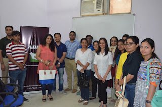
Information Developers Foundation-August, 2015
Information Developers Meetups Snaps of Information Developers Foundation meetup on 22 August 2015. It was attended by top-notch technical writers of NCR and the presentations were truly amazing.The best part was it was interactive. Interactive technical writing session in progress Bipul presented a very interesting talk on the importance of UX in developers guide.Bipul from GlobalLogic talking on UX in documentation. Ankur Srivastav guru of DITA talk about the information mapping through DITA. DITA man Ankur Rinni talk about one of the latest concept of documentation DocOps.Rinni still try to find out why tech writing? Puja Gandhi from Agilent and Ankur Srivastava from Freescale. Rinni Mahajan From Inteera System and Manisha Khurana from Comviva. Dipti sharing pain point of technical writers. Dr.Anu from Fiserv and Dipti Sehgal from Pitney Bose. Participant of the Information Developers Consortium- August 2015 Rahul Karn- Co-Founder of ApraDocs Information Developers

Top 3 Best Technical Writing Courses, India
Top 3 Best Technical writing Institutes in India If you are planning to take a technical writing course in India and want to compare technical writing institutes in India this list will help you. We have listed it city wise. Bonus! Get your FREE Membership Now of Information Developers Foundation. We strongly recommend you to know the mentor’s credibility and the syllabus before joining any course. Download the syllabus of all the national and international institutes, read famous blogs, and figure out what you have to learn. Before joining talk to the mentor and clarify how and what will be the outcome of the course. Technical writing course provider in India Before contacting any institute we recommend you to read this blog post. ( How to Become Technical writer). Top 1 recommended Institute for technical writing training in India is Information Developers Foundation Due to excellent placement, latest syllabus, and different types, of course, this institute is awarded as the best institute. You can see the complete course details. 3 Best Technical writing Institute in Mumbai 9 Best Technical writing Institute in Bangalore 4 best Technical writing Institute in Hyderabad 3 Best Technical writing Institute in Pune 5 Best Technical writing Institute in Chennai Now, it is your turn to take action see the complete syllabus of Information Developers Foundation. We are not limited by boundaries we are derived from the latest technologies. Am I missing any Institute? Did you find any information that’s incorrect or obsolete? Please help me to keep this page useful and up to date with your valuable comment. Over time, we will add more. If you are confused to join which institute you can call us on 7840841999. We can recommend you as per your requirement.
Difference between Editing and Proofreading
Difference between editing and proofreading is work from Megha Gola, A student of Information Developers and employee of Vikash Technical publication, New Delhi. Now Megha is working with Emersion Noida. There is a very thin line between both processes. In this table, I’m trying to summarize the difference. Feel free to add more points if I missed something. Editing Proofreading It is the first task that should be undertaken after finishing the first draft of a piece of text. It involves checking the text in detail after the editing stage, to detect errors in spelling, punctuation, grammar and format. Editing requires focusing on the content of the text. The key goals are to check that the text: a) flows logically b) meaningful as whole c) is clearly expressed d) is accurate in the information it provides e) is concise f) makes its purpose clearh)is targeted towards the reader The aim of proofreading is to spot and correct errors in: a) spelling b) typography c) grammar, punctuation and use of language d) style and formate) anything missed at the editing stage Editing requires careful analysis and critical thinking. Proofreading requires a great deal of attention to detail.

Word2013 TOC: Picture and Text in a Table of Content
MS Word TOC Issue Recently one of my students asked me to fix her auto-generated table of contents (TOC) in Word. Somehow she ended up with a picture and text in there and she don’t have any clue, and it keeps coming back when they regenerate the TOC. Let us dive deep, how we create auto-generated TOC. The default behavior of Word is to use Heading styles to create the TOC and the Caption style to create lists of figures and tables. The paragraph, picture and text is in a Heading or Caption style applied to it. Do you want to learn the nitty-gritty of Word 2013. Contact ApraDocs Information Developers.Technical writing training Institute.

Why Insert Image not Copy&Paste
Copy/Paste vs Inserting Images I’m assuming that a lot of images used in PowerPoint or Word come from the web.I’m also guessing that most people may realize that most images on the web have been compressed in anyhow to provide a balance of quality and maintain small file size. What I don’t think many people realize is that when you copy & paste images directly from the web into PowerPoint that you lose much of that compression and wind up with a bigger file size than you need to have. The reason is that whenever a picture is copied to the computer’s clipboard and then pasted into PowerPoint (or Word, etc) the picture is pasted as a bitmap—regardless of the file format of the original picture. Bitmap file sizes are much larger and have less detail which leaves you with a much larger Word or PowerPoint file than necessary, particularly if you have used multiple images this way. So instead of copying & pasting directly from the web into your document, you should save them first and then Insert them via the Insert menu instead. I did a quick test with the following results: MethodFile Size (kb) Copy & Paste 2,027 Copy & Paste (Compressed) 440 Insert 300 Notice that even after using PowerPoint’s option for compressing the pasted images, the file size was still larger than the file using inserted images.

Difference and Use of different fonts for technical documentation
So, as a Technical writer, it makes sense to make sure the font you or your clients use does not hinder sales. Font size also impacts the reliability and overall experience of the reader. Correct Font can also impact the cost of documentation, think how Let us talk about it: The difference between ‘serif’ and ‘sans serif’ fonts Serif fonts have little feet and embellishments on the tip and base of each letter, making them more distinct and recognizable. Popular serif fonts are Times New Roman, Palatino, Georgia, Courier, Bookman, and Garamond.Nearly all books, newspapers, and magazines use a serif font. It’s popularly accepted that – in print – serif fonts are easier to read. The idea is that the serifs make the letters flow together – and subsequently easier on the eyes.As the name states, ‘sans serif’ fonts are fonts without serifs. While some sources say sans-serif fonts have existed since the 5th century BC, it wasn’t until the 1920s that they became somewhat popular – mostly being used in advertisements.One of the reasons for their lack of popularity was that typographers stuck with serif fonts because they felt they were easier to read.It’s been said that serif fonts are for “readability,” while sans-serif fonts are for “legibility.” This is why, in print, sans-serif fonts are often used as the headline font, and serif fonts are used for the body text.Some popular San Serif fonts are Helvetica, Arial, Calibri, Century Gothic, and Verdana. Subscribe to our YouTube channel for more information like this. Best fonts for print In his book Cashvertising, Drew Eric Whitman cites a 1986 study of fonts (printed on paper) that found only 12 percent of participants effectively comprehended a paragraph set in sans-serif type versus 67 percent who were given a version set in serif typeface.Those who read the sans-serif version said they had a tough time reading the text and “continually had to backtrack to regain comprehension.”In a test of three different fonts, two serifs (Garamond and Times New Roman) and one sans serif (Helvetica), he found 66 percent were able to comprehend Garamond; 31.5 percent Times New Roman, and 12.5 percent Helvetica (out of a total of 1,010,000 people surveyed).The conclusion being that serif fonts are easier to read when it comes to fonts on paper. So, if you’re sending out a sales letter or brochure in the mail, you probably want to use serif font (but, as mentioned in the first point, you could use sans-serif font for your headlines).Here are the print font preferences of three of the copywriting greats: 1) advertising great John Caples liked using Cheltenham Bold for headlines; 2) advertising legend David Ogilvy preferred the Century family, Caslon, Baskerville, and Jenson; and 3) direct marketing guru Gary Halbert used Courier in his sales letters. Best fonts for online Now, one might assume that what works on the printed page will be similar to what works on the computer screen. But that’s not the case.To make the little serifs appear legible, a high degree of resolution is required. The more pixels, the more details of the font you can display.Back 10 or so years ago, the best computer screen resolution was 800 x 600 pixels – which wasn’t great for defining the intricacies of a serif font. Screen resolution has increased through the years (resolutions of 1024 x 768 pixels or greater have become the norm). This makes serif fonts more legible but still generally not as easy to read as sans-serif fonts.Plus, now you have to consider how your site or email will look on handheld devices, such as the BlackBerry and iPhone. The latest model of iPhone 4 has a screen resolution of 960 x 640 pixels. The BlackBerry Bold 978 has a screen resolution of 480 x 360 pixels.So online, the best font to go with is sans serif.A 2002 study by the Software Usability and Research Laboratory concluded that:The most legible fonts were Arial, Courier, and Verdana.At a 10-point size, participants preferred Verdana. Times New Roman was the least preferred.At 12-point size, Arial was preferred and Times New Roman was the least preferred.The preferred font overall was Verdana, and Times New Roman was the least preferred.So here are your marching orders:For easiest online reading, use Arial 12-point size and larger. If you’re going smaller than 12 points, Verdana at 10 points is your best choice. If you’re after a formal look, use the font “Georgia.” And for older readers, use at least a 14-point font. Best fonts for email Dr. Ralph F. Wilson, an e-commerce consultant, did a series of tests in 2001. He also came to the conclusion that the sans-serif fonts are more suited to the computer screen.Some of the highlights of the test results were that at 12 points, respondents showed a preference for Arial over Verdana – 53% to 43% (with 4% not being able to distinguish between the two).Two-thirds of respondents found that Verdana at 12 points was too large for body text, but Verdana at 10 points was voted more readable than Arial at 10 points by a 2 to 1 margin.In conclusion, for the best font readability, use Arial 12 point or Verdana at 10 points and 9 points for body text. For headlines, he suggests using larger bold Verdana. Deciding on a font So the next time you submit a sales letter or email to your client, it might be a good idea to ask them what font they intend to use.If they plan to use a serif font online or in an email, you might want to gently nudge them away from it and recommend a more easily readable sans-serif font.If they also plan to send your copy to their list via regular mail, it’s not a bad idea to suggest they switch over to a serif font at least for the body text.It could mean the difference between a winning piece of copy and one that only delivers so-so results. Credit to the original
Salary survey of Indian technical writers
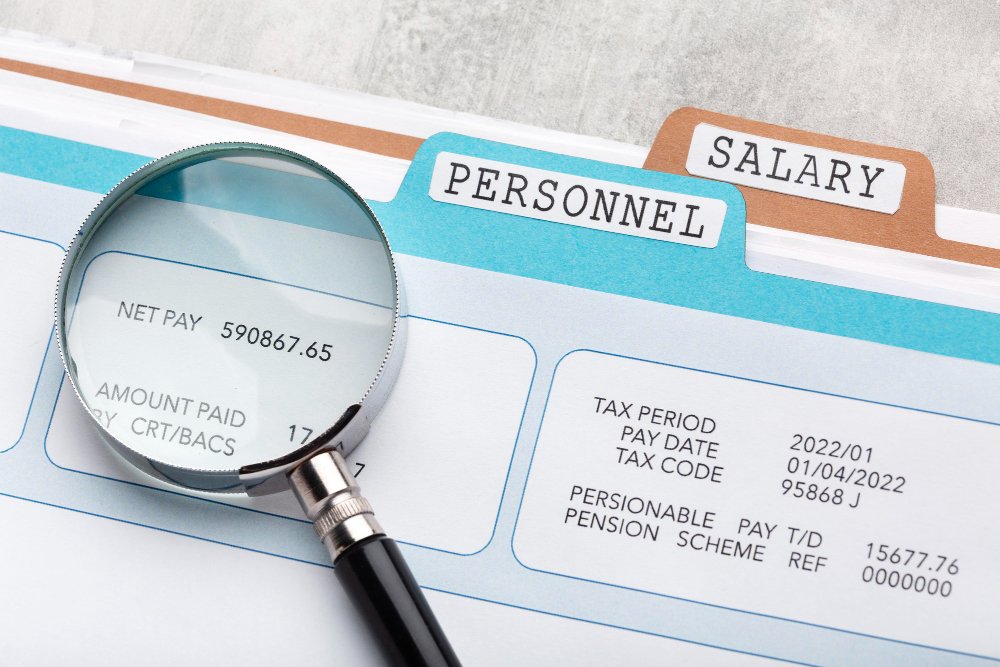
Technical writer salary Salary Survey 2017 Interested to know in which direction the salary of technical writers is going. Here is a good news at the starting of the year 2017. Technical writing in the highest paying jobs in India claims Economics Times. Excerpt from the Newspaper Technical writer2 January 2017Technical writer While writers and content writers are one thing, technical writers are completely different. They also write but their focus is mostly on technicalities related to an IT firm or programming company. For companies specializing in technology like Adobe, Oracle, and similar brands, a technical writer is a must. Minimum Qualification: Graduate Salary range: Rs 50,000 to Rs 1.7 lakh a month To read more click here. You can read the detail salary survey of the year 2017 on the STC-India website. Salary Survey 2014 STC India chapter recently released their salary survey results for 2014 in 16th STC annual conference at Bangalore which provides an insight about the technical writer’s salaries in India and also about the technical writing industry growth in India. This valuable and benchmark is the result of Paresh Naik. Kudos to Paresh’s indeed a great job in publishing this salary survey! So what do you think about your salary!!! Have a look before you change in 2015 so that you can make maximum from the new market recovered from the recession. For me, the good news is my area (NCR) is the highest paying area in India followed by Pune for the same experience level. On the other hand, this year salary decrease by 11.9% compared to thesame in 2013. Really sad. For international friend 1USD = 67 INR Some Interesting Findings from the data Measures used in this report Survey according to experience Base: The total responses in a given category.Mean: The value computed by averaging the tabulated responses. 10%: Ten percent of the responses were below this value; ninetypercent were above this value. 25%: Twenty-five percent of the responses were below this value;seventy-five percent were above this value. 50%: Fifty percent of the responses were below this value; fiftypercent were above this value. This is also called the median. 75%: Seventy-five percent of the responses were below this value;twenty-five percent were above this value. 90%: Ninety percent of the responses were below this value; tenpercent were above this value. TrimMean: This value is the mean taken by excluding 10% of datapoints from the top and bottom tails of a data set. In other words, thisis an average of values excluding the extreme cases. Salary/year of experience: Most of the tables also indicate themeasures for salary/year of experience. This parameter is included tocompare the influence of various factors on the salary on level grounds,i.e. to exclude the effect of experience. If all or most of the surveyparticipants from a specific category have a higher number of years ofexperience, the average salary in that particular category may bereflected as very high. In such cases, the salary/year of experienceparameter will give a more realistic comparison of salaries in relatedcategories. All the salary figures mentioned in this report are in Indian Rupeesunless specifically mentioned otherwise

Gerund rule for technical writers
Hi Folk, One of the irrepressible skill of technical writers is good English. We can achieve this by practice. In this series, we are trying to share some good rules of writing. This is a brief about “Gerund Rules”. Hope you all like the post!! Gerund looks exactly the same as a present participle, and for this reason, it is now common to call both forms ‘the -ing form’. However, it is useful to understand the difference between the two. The gerund always has the same function as a noun (although it looks like a verb) so it can be used: Rule1: As the subject of the sentence: Rule 2: As the complement of the verb ‘to be’: Rule 3: After prepositions. The gerund must be used when a verb comes after a preposition: Note: This is also true of certain expressions ending with a preposition, e.g. in spite of, there’s no point in..: Rule4: After a number of ‘phrasal verbs’ which are composed of a verb + preposition/adverb Example: to look forward to, to give up, to be for/against, to take, to put off, to keep on: NOTE: There are some phrasal verbs and other expressions that include the word ‘to’ as a preposition, not as part of a to-infinitive: – to look forward to, to take to, to be accustomed to, to be used to. It is important to recognize that ‘to’ is a preposition in these cases, as it must be followed by a gerund: Note: It is possible to check whether ‘to is a preposition or part of a to-infinitive: if you can put a noun or the pronoun ‘it’ after it, then it is a preposition and must be followed by a gerund: Rule5: In compound nouns Example: a driving lesson, a swimming pool, bird-watching, train-spotting It is clear that the meaning is that of a noun, not of a continuous verb. Example: the pool is not swimming, it is a pool for swimming in. Rule6: After the expressions: can’t help, can’t stand, it’s no use/good, and the adjective worth: